Notes on digital fashion photography
Light behaves differently when it is authored. A short primer on composing frames that read as photographs, not renders.
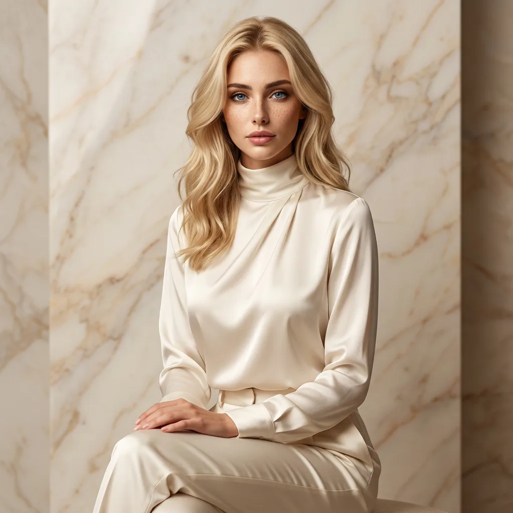
The eye recognises certain accidents — a flare that lands imperfectly, a shadow that folds where you did not plan. Without them, an image reads as a render. It is a small vocabulary, but a decisive one: the difference between a photograph and a diagram is rarely the subject, only the light.
Authored light, borrowed weather
Composing digital fashion frames is largely the practice of putting those accidents back in. A slightly wrong crop. A backlight that spills. A colour cast borrowed from a season, not a swatch. The trick is to author the accident — to decide where the imperfection falls, then place it with the conviction of something that merely happened.
Natural light carries its own fingerprints, and a digital frame must be given the same parentage. Overcast diffusion reads as northern; a low amber rake reads as coastal evening. The climate of an image is chosen before anything else in it is built.
Texture is the truth-teller
Nothing dates a render faster than flawless surfaces. Fabric should crease where a body would crease it; stone should hold the memory of rain. A wool cuff that catches the wind is worth more to the credibility of a frame than any amount of resolution.
In practice this means spending as much time on what the light falls beside as on what it illuminates. The worn bench next to the couture gown, the salt haze in front of the horizon — these are the witnesses that testify the scene exists.
Captured, not calculated
The frame should feel captured, not calculated. That is the whole discipline. A viewer cannot name what changed, only that the image feels remembered rather than manufactured — and that feeling is the entire product.
When it works, the process disappears entirely. The audience sees a woman on a cold shoreline in an ivory coat, and the hours of rendering behind her dissolve into a single, quiet moment of weather.
Five habits for believable frames
First, choose one light source and commit to it. Mixed lighting is the most common giveaway in digital fashion photography; real locations rarely offer more than the sky and whatever it reflects off.
Second, crop like a photographer, not a designer. Let an elbow leave the frame, let the horizon tilt a degree. Perfect centring belongs to product shots, not to editorials.
Third, give the garment weight. Hems should hang, collars should lift in wind, wool should look heavier than silk. Fabric that floats without reason reads instantly as synthetic.
Fourth, respect depth of field. A real lens cannot keep a face, a coat and a mountain range equally sharp; choosing where focus falls is choosing what the image is about.
Fifth, edit with distance. Return to a selection a day later and remove anything that impressed you only because it was difficult to make. What is left is usually the portfolio.